My Home Website
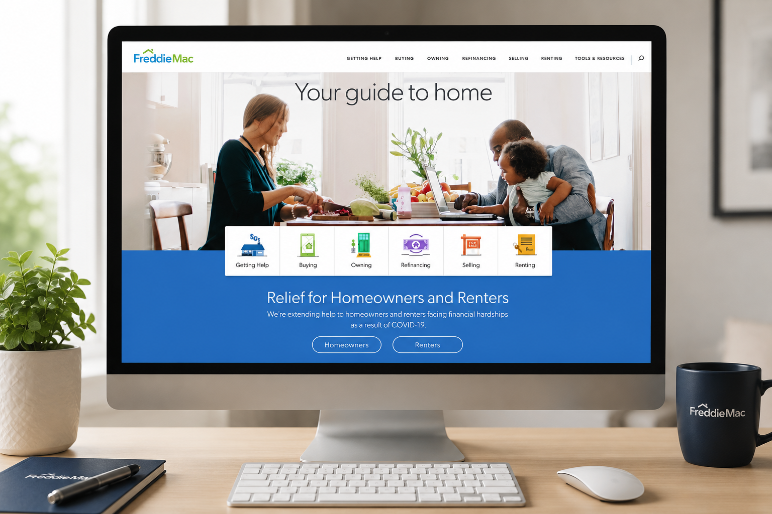
As part of Freddie Mac's Corporate Digital Team, I served as the sole UX designer responsible for redesigning the My Home website—one of Freddie Mac's largest consumer-facing educational experiences.
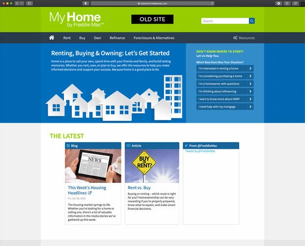
The original site launched after the 2008 housing crisis to educate homeowners about foreclosure prevention. Twelve years later, consumer needs had evolved significantly. Our goal was to transform the website into a comprehensive resource supporting prospective homebuyers, renters, and homeowners throughout every stage of their housing journey.
The Challenge
The existing experience no longer reflected how modern consumers searched for or consumed information.
Users were overwhelmed by complex housing topics, fragmented content, and navigation that didn't align with their goals.
The redesign needed to support multiple audiences while remaining flexible enough to adapt during changing economic conditions.
Business Challenges
Outdated information architecture
Complex navigation
Growing content library
Multiple customer journeys
Limited mobile optimization
Difficult content discovery
Need for future scalability
My Role
As the project's UX lead, I owned the end-to-end user experience.
Responsibilities
Planned UX research
Facilitated stakeholder workshops
Conducted competitive analysis
Redesigned information architecture
Created customer journey maps
Produced wireframes and prototypes
Led usability testing
Collaborated with engineering throughout implementation
Validated designs before launch
Discovery
Understanding user needs was the foundation of every design decision.
User Research
I worked with stakeholders to identify the primary audiences:
First-time homebuyers
Existing homeowners
Renters
Consumers experiencing financial hardship
Research revealed that users wanted straightforward guidance and the ability to quickly find information relevant to their specific situation.
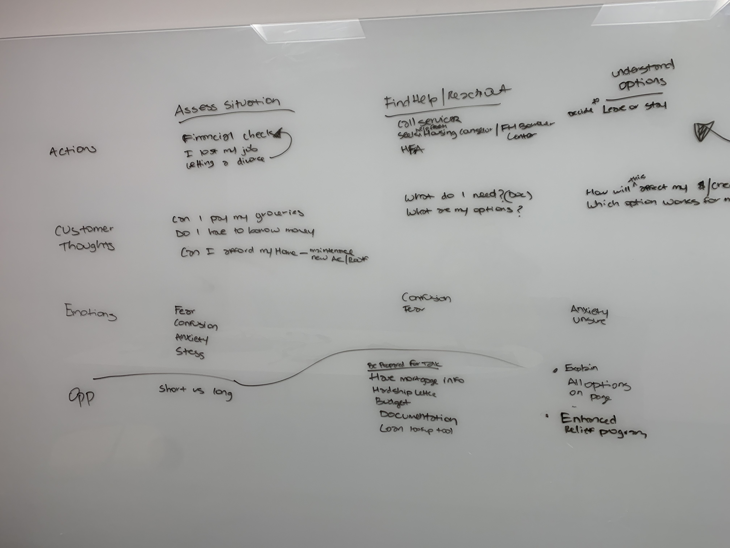
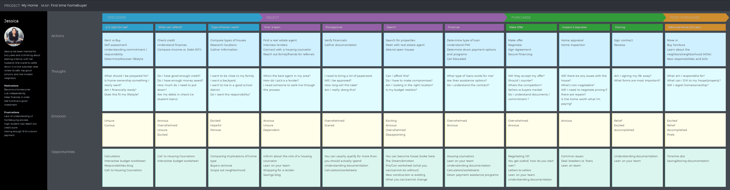
Customer Journey Mapping
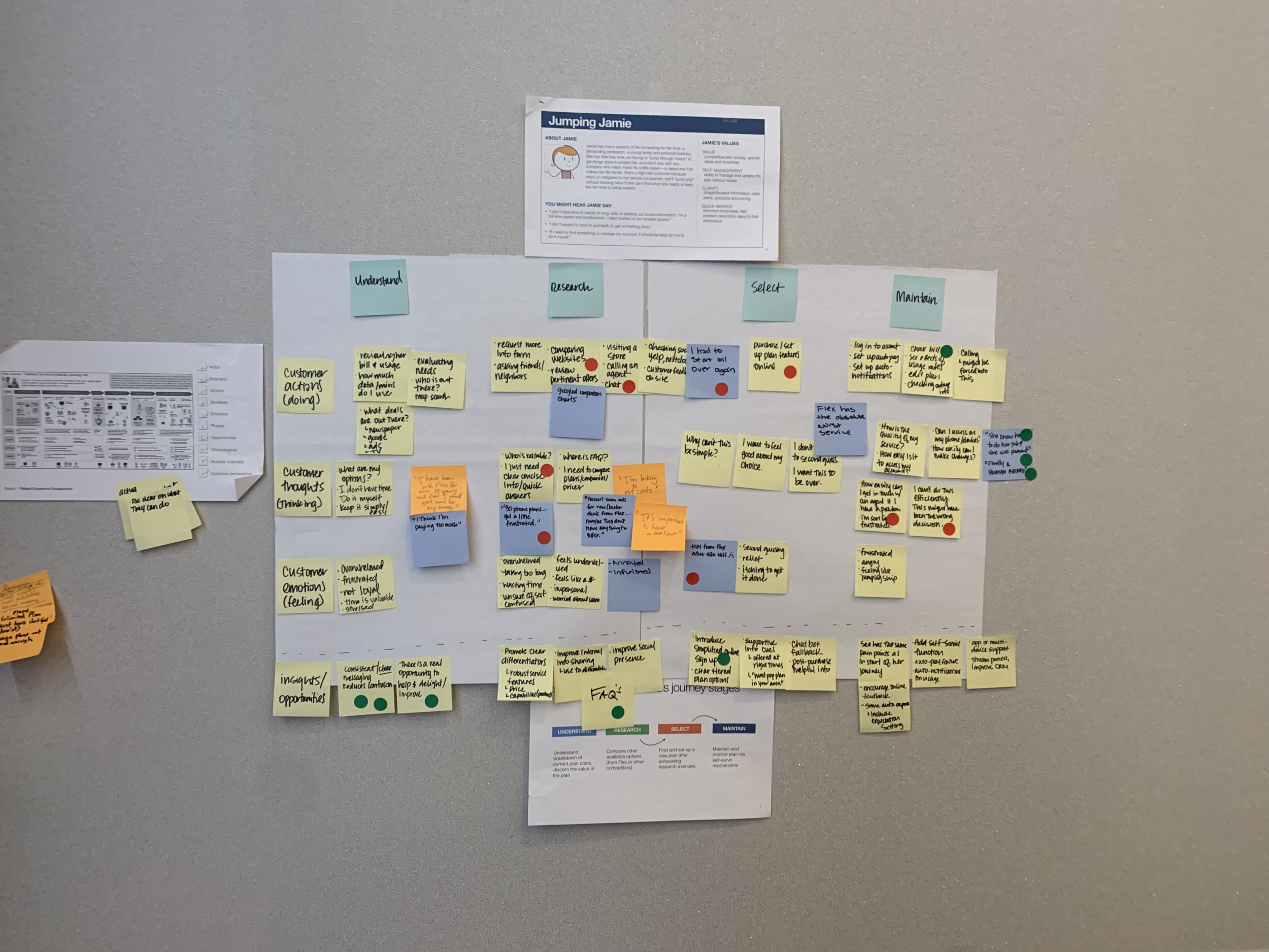
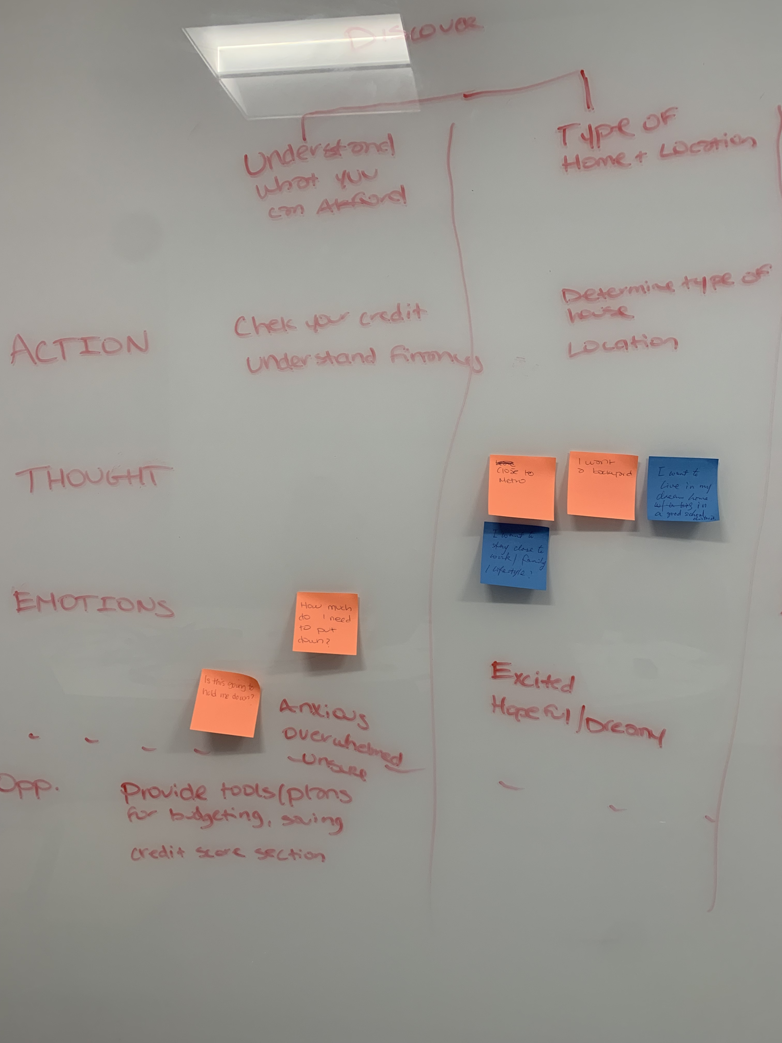
One of the first activities was redefining the customer journey.
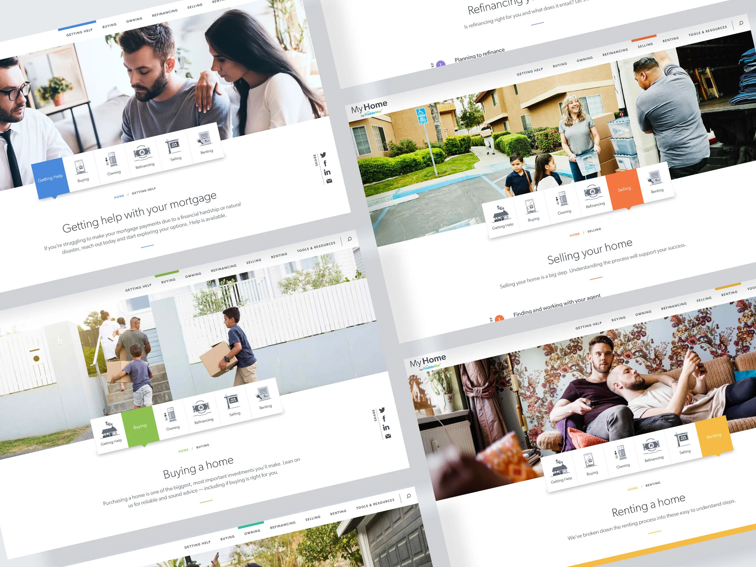
Instead of organizing content around Freddie Mac's internal structure, we reorganized the experience around users' goals.
Key Insight
Users preferred to self-identify based on their life stage rather than navigate through complex categories.
This insight became the foundation for the new navigation model.
Information Architecture
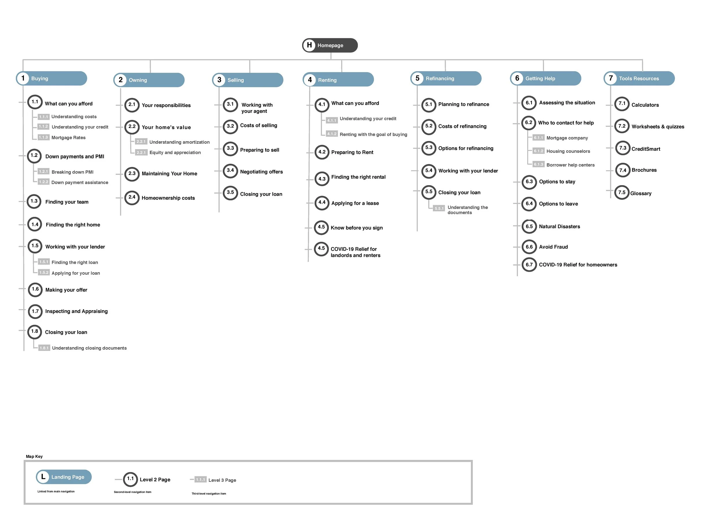
The site's information architecture was completely redesigned.
Goals
Simplify navigation
Reduce cognitive load
Surface high-value content
Create clear user pathways
Improve content discoverability
The new structure enabled visitors to immediately identify where they were in the homeownership journey and easily move between related resources.
Competitive Analysis
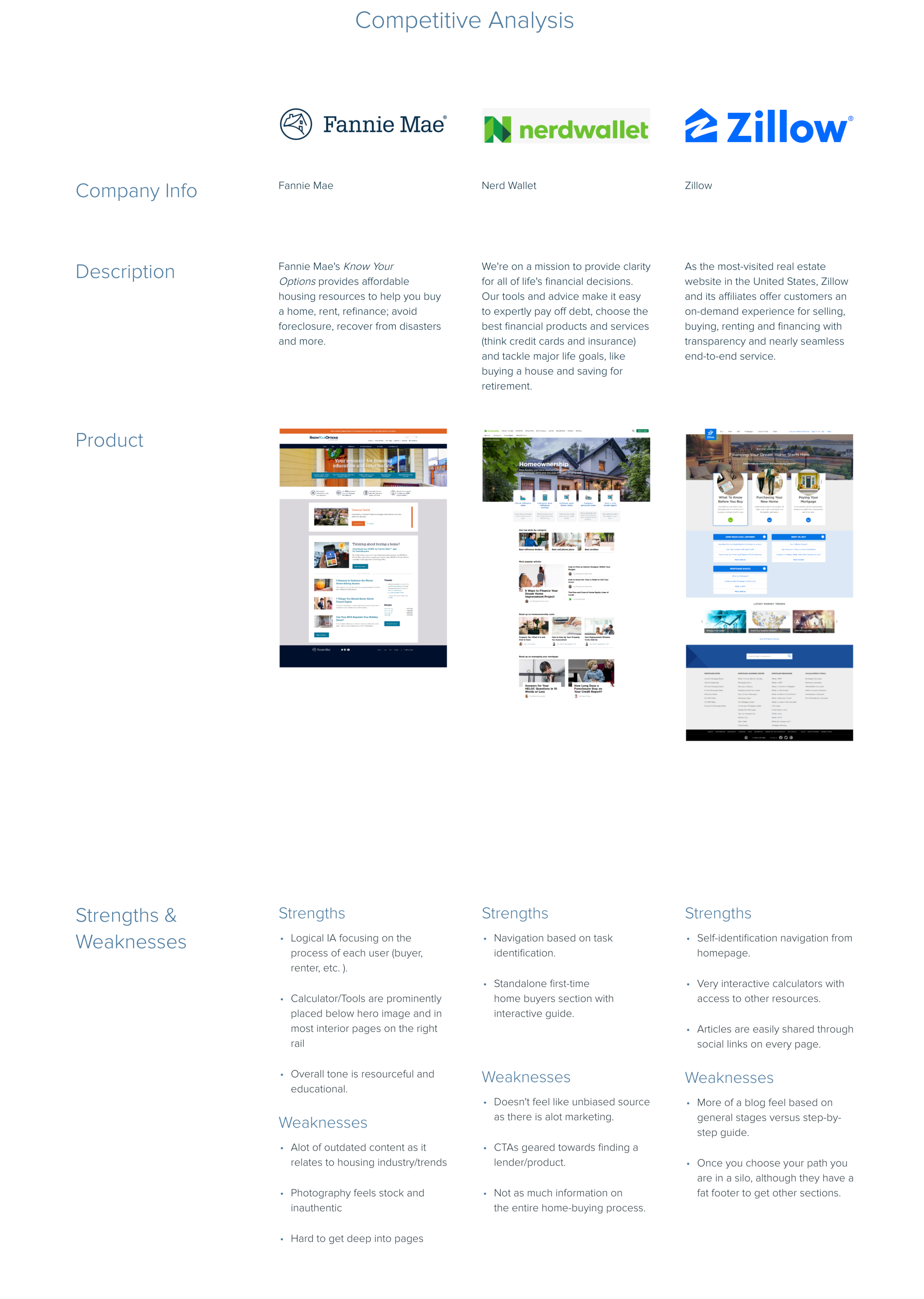
I evaluated both direct and indirect competitors to understand evolving trends within the housing and financial services industries.
Areas Evaluated
Navigation models
Homepage hierarchy
Content organization
Interactive tools
Mobile experiences
Visual design
Educational resources
Key Findings
Users preferred to self-identify
Most successful competitors organized content around user goals rather than product categories.
Interactive experiences increased engagement
Mortgage calculators and decision-support tools created more engaging user experiences than static content alone.
Editorial-style layouts improved readability
Competitor sites increasingly adopted modern blog-inspired layouts that encouraged exploration while making complex information easier to digest.
These findings directly influenced the design direction of the new website.
Wireframes & Prototypes
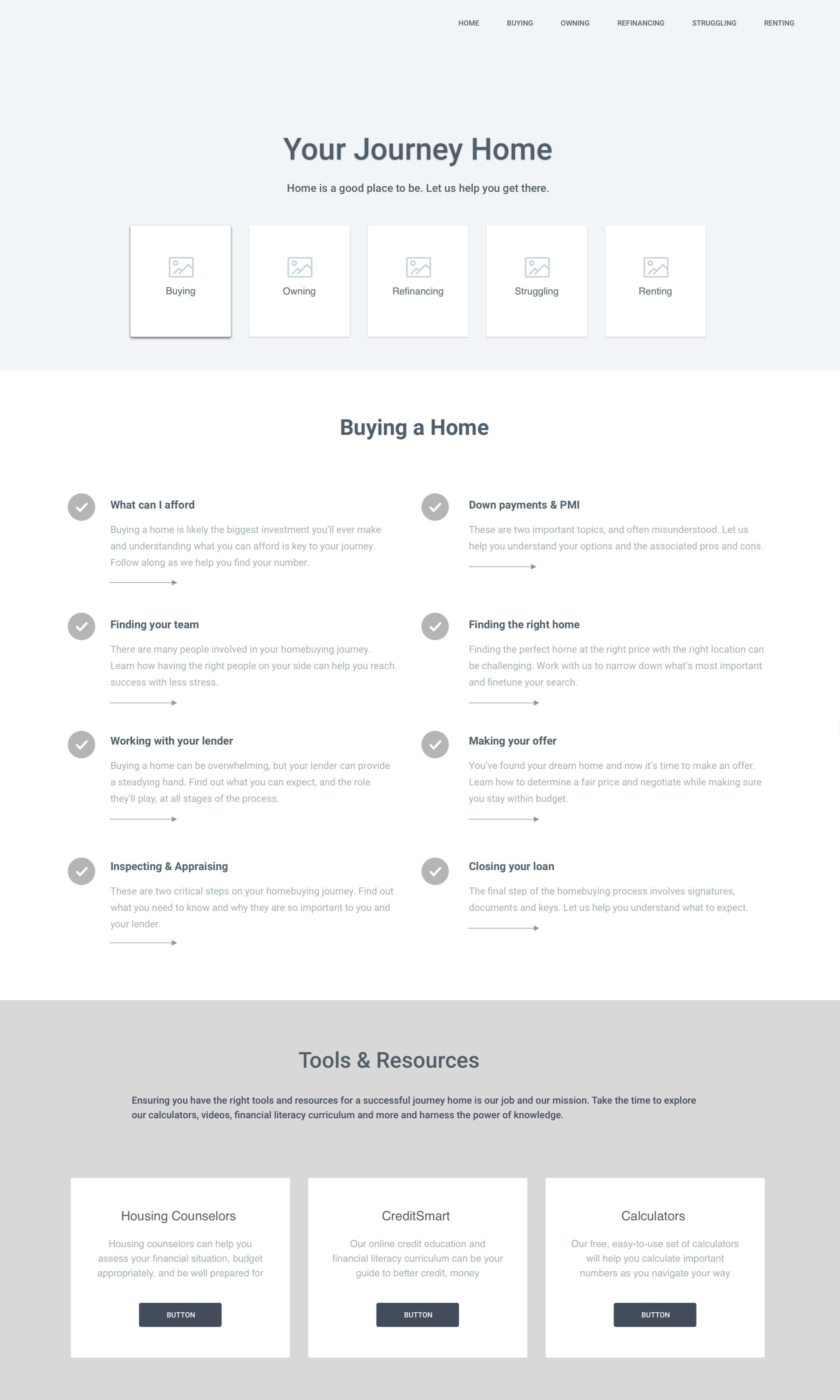
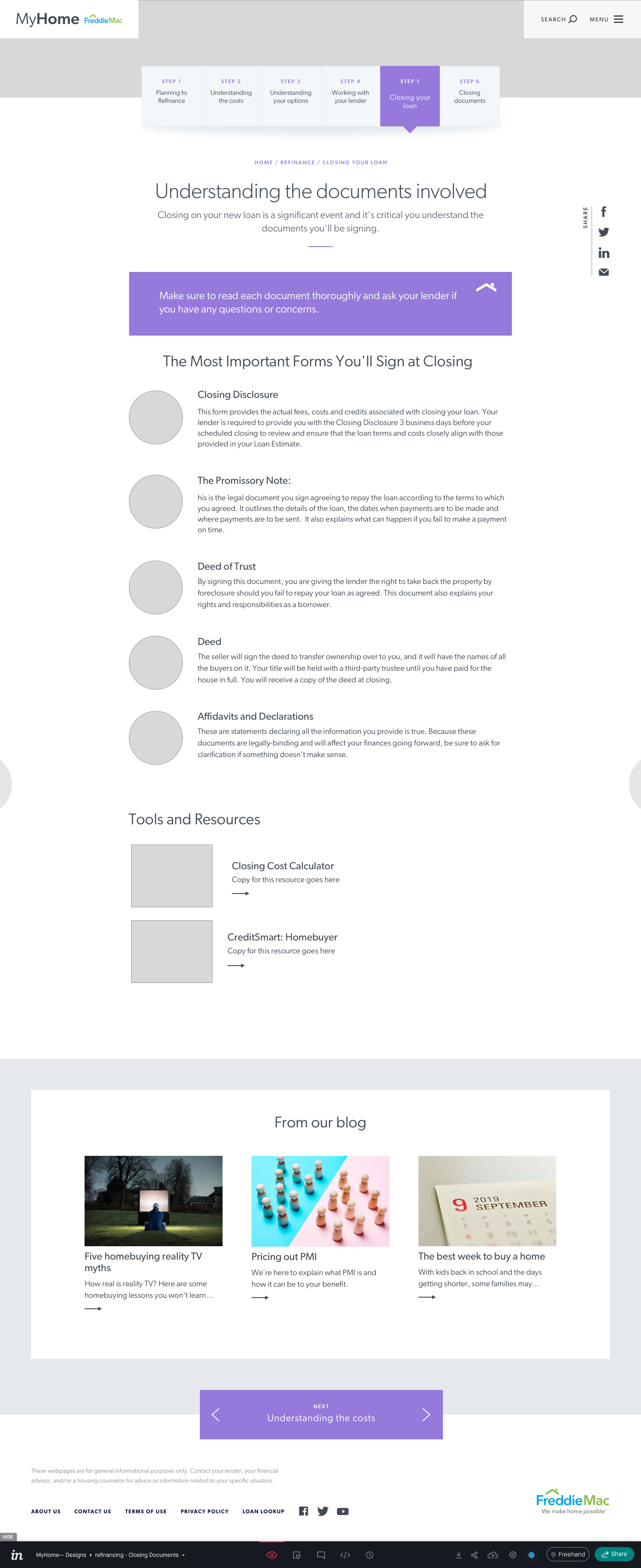
With the research complete, I translated insights into low-fidelity wireframes before iterating into interactive prototypes.
Throughout multiple design iterations, I collaborated with stakeholders to validate layouts and navigation while balancing user needs with business objectives.
Design priorities included:
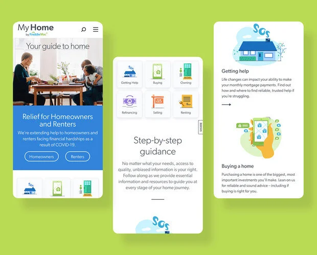
Mobile-first layouts
Clear navigation
Flexible content modules
Scannable page hierarchy
Accessible interactions
Simple decision pathways
Design Principles
The final experience emphasized:
Simplicity
Reduce complexity and make housing information approachable.
Guidance
Help users identify the right path based on their personal situation.
Accessibility
Create an inclusive experience that worked for everyone.
Mobile First
Support users wherever they were searching for information.
Flexibility
Allow content priorities to evolve as market conditions changed.
Solution
Originally, the redesign focused primarily on helping first-time homebuyers navigate a strong housing market.
However, during the final stages of development, COVID-19 dramatically changed consumer priorities.
Working with business stakeholders, we quickly shifted the website strategy to prioritize:
Mortgage forbearance information
Financial hardship resources
Relief programs
Consumer education
Clear next steps for homeowners facing uncertainty
Because the experience had been designed around flexible customer journeys rather than fixed content, the team was able to pivot rapidly without redesigning the entire website.
Results
-
245%
Increase in website sessions
-
243%
Increase in users
-
1.3 Million+
Page views
-
60+ seconds
Average engagement time